A distinctive first impression
An immersive opening and confident typography establish the tone immediately. Photography, colour and composition work together to make the website feel like one coherent brand.
A confident web presence for a new training box in A Coruña. The ambition: the professional feel of leading US gyms, with a character of its own.
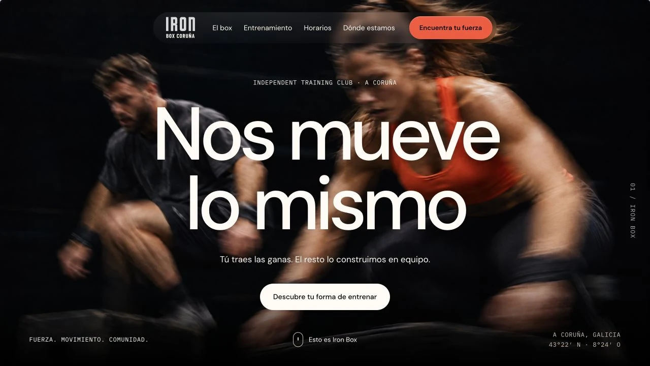
01 / The brief
Ironbox was starting a new chapter in A Coruña and needed its website to communicate that ambition from day one. The brief was to create the feeling of a serious, contemporary training destination, taking inspiration from the most polished gyms in the United States.
Before stepping into a new box, people want to know what it stands for and whether it is right for them. The challenge was to combine the energy of training with the clarity and confidence of a professional organisation.
02 / The direction
We translated the brief into a strong visual rhythm: large typography, a dark palette, warm accents and training-led imagery. A clear page structure turns that first impression into practical information about the box and the training experience.

Across every screen
A strong visual identity is only the beginning. Clear information about classes and the weekly rhythm gives prospective members a way to imagine training at the box.
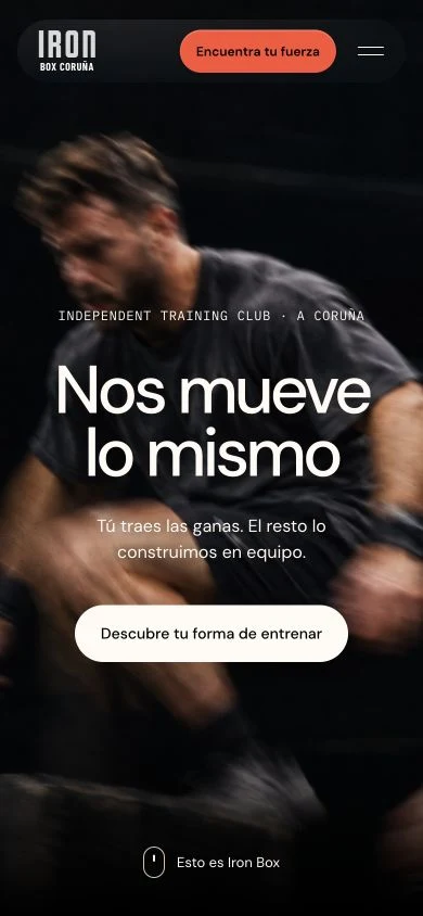
An immersive opening and confident typography establish the tone immediately. Photography, colour and composition work together to make the website feel like one coherent brand.
The design gives the training offer its own space, introducing CrossFit, Iron Move, Open Box and Hyrox through a consistent system of imagery, typography and concise explanations.
An interactive weekly timetable brings the training offer into focus. Day and week views, class filters and session details make the programme easier to navigate.
04 / The result
A digital introduction to Ironbox: a strong identity, a legible training offer and the practical information a new member needs. A website designed to make the ambition of the box visible before anyone walks through the door.
View website preview (opens in a new tab)Next case study